Startup MVP @ Hale Sports

Hale Sports is a sports tech start-up offering customers a range of biomedical tests and insights to improve athletic performance. I worked with Hale as the lead designer and consultant to help the team develop the product user flow, visual identity, and design system. The first iteration was executed over a three-month period, and further iterations and feature launches continued over the course of a year. The primary challenge was finding ways to display the test results and insights digestibly to users.


Summary


Primary Challenge: Content strategy and design system creation.

Secondary Challenge: Balancing scientific insights with digestible copy and intuitive wayfinding

Format: Desktop & Mobile Responsive Web App


starting from the top


Short-term client goal:

Launch a beta app experience allowing users to access their test results and track their performance goal progression

Long-term client goal:

Scale product offerings to incorporate neural network algorithms and enhanced feedback predictions as the user base grows

The team:

  • CEO

  • Program Associate

  • Lead full-stack developer

  • Front-end developer

  • Data scientist

UX considerations:

  • Standardize data visualization of test results

  • Incorporate a design system that could scale and incorporate more in-depth results feedback

  • Provide summary view and in-depth view for both athletes and coaches/trainers

  • Establish a modular visual design and foster strong knowledge of implementation with developers for future scaling

Information Architecture

I started my engagement with Hale very early in their product. The CEO assembled a team of engineers and industry experts and created insight categories and proprietary algorithms. They obtained users to undergo the biomedical tests and returned results. Their key challenge was turning those results into a visual interface where users could interact with their results and gain additional insights. Initially, the company wanted to develop a native app, so I began by fleshing out information architecture.

 
IMG_1767.jpg


Mobile to web

While there was buy-in for the initial design of the native app solution, leadership decided to focus on a mobile responsive web design for the first product iteration. I repurposed the user flow and initial wireframes for mobile-web.

 
Hale_userflow_v3.jpg


Displaying test results


Initially, the client offered the following testing reports and analyses: genetics, microbiome, force plate, and clinical labs. I started by analyzing samples of the written reports and noted things like the type of result output e.g. numerical value, range, category, etc. The client and I worked through possible visualizations in a sketching session where the client talked me through their vision and I iterated on possible visuals. Once we made the decision to pivot from native app development to mobile responsive web, I adapted some of the design patterns we explored in low-fi.


high fidelity iteration


Goal 1: Create a consistent visual pattern to display both qualitative and quantitative data at various scales

Goal 2: Provide the user with summary results and in-depth results

Goal 3: Incorporate result comparisons for users to contextualize their own results to the larger sample population

As I worked through the visualization of the test results I wanted to maintain consistency. It was apparent that each test result would require some level of customization. For instance, the genetic test results were displayed by type of gene and evaluated based on their rarity and contribution to physical traits while the force plate results were displayed based on a numerical value and evaluated based on a range and in comparison to other athletes. However, the experience still needed to feel visually cohesive throughout so I developed a design system of elements based on Material design.

The results overview at the top of each page serves as an overview to show athletes how their results compare to larger population samples. The individual results are categorized by the attributes that they coincide with. For instance, a user’s relative peak power result in their force plate report speaks to their overall power attribute.

Individual result cards would always be the same dimensions and in the same position on the page while the results overview would also stay consistent across pages.


First iteration of modular design system based on Material Design standards

Early iteration of force plate results report with placeholder text and sample data visualization

Early iteration of genetic results report with placeholder text and sample data visualization


USER TESTING

Goal 1: Assess wayfinding and task flow of current architecture

Goal 2: Assess which features to prioritize for future scaling

Goal 3: Assess the effectiveness of data visualizations and the overall impact of results

The client rolled out the product's first iteration to a pilot test sample of around 50 users across the country. After three months of use, I interviewed eight of the users.

Users started at the home page, where they could navigate between their performance plan and test results.


Findings

  1. Users were most influenced by results and recommendations impacted by diet because of their actionability. One user actually followed up with his primary care provider to re-test his iron levels after he made changes to his diet based on recommendations from his report.

  2. Users were least influenced by their genetic testing results but found the data visualization very useful for at-a-glance comprehension.

  3. The attributes and their definitions were understood. There were very few questions about what the attributes signified or how they related to their overall performance which was positive.

  4. There were questions about whether results framed as genetically predisposed weaknesses were areas to focus on improving or to simply accept and work around.

  5. Wayfinding was largely successful amongst users.

  6. Users wanted to know how their rankings stacked up against other athletes and more focus on what they could do to get the competitive edge.

  7. This sample of users had limited agency over their workout regimens. They relied on their school’s coaches and trainers to dictate their workouts. Many of them shared their results with their coaches but were unclear how or if that influenced their workout schedule.


NEW CONTENT and Iteration

Goa 1: Accommodate updated result descriptions

Goal 2: Add athlete average and peak performer data visualizations to individual results

Goal 3: Improve labeling and navigation between results

I iterated on the formatting of the results pages based on updates to the content and copy as the company continued to develop the product with expert consultants. In the early iterations I designed based on placeholder text and descriptions of the content. After samples of the content were provided I made the following changes:

Adjusting the dimensions of the individual test results

The initial width couldn’t accommodate the updated copy so I increased the width and changed the pattern to a single column for both desktop and mobile.

Customized the sub-navigation for each result report

I incorporated an expand and collapse sub-navigation pattern to help users navigate through a long list of results. Each result has a different categorization for the sub-navigation. For instance, the clinical labs report- which displays the results like a user’s potassium levels or carbon dioxide- is divided by results that are in-range and out of range. The genetics report displays results based on rare genes and common genes. While force plate testing displays the users strengths (or maneuvers that they performed within the top percentile of other athletes) and improvement areas.


Clinical trials report. Results are categorized based on being in-range or out of range for normal levels.

Genetics report: results are categorized based on rare genes and common genes.


Motivating users with results


Goal: Motivate users to take action with their test results and foster long-term engagement

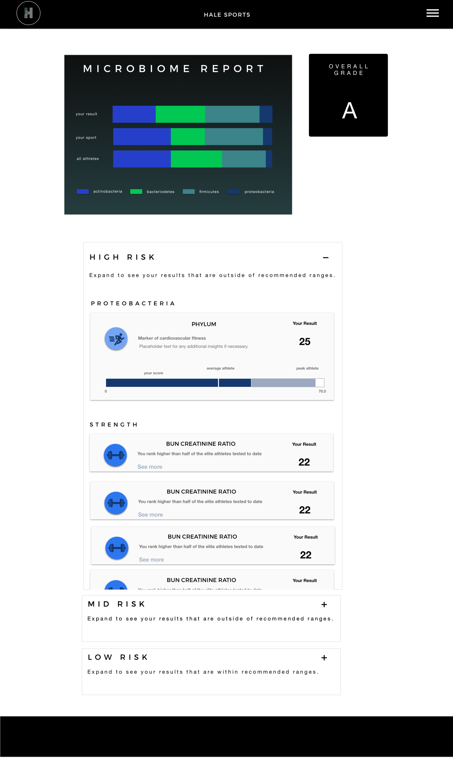
Finally, microbiome results were organized based on high risk or out of normal range deescalating to low risk. This presentation served as a proxy AB test. The client and I discussed the benefits and possible setbacks of presenting the “bad news” over the “good news” and what would be more of a motivator to get users to track their progress and be proactive about making changes in the long term. We settled on prioritizing the “bad news” for the microbiome test because it is one of the easier results to influence since it’s mostly based on making dietary changes. Your body’s microbiome can change over the course of a few meals. In contrast we focused on prioritizing strengths in the force plate testing because results are based on your musculoskeletal structure and not easily changed.


Microbiome report: results are categorized based on high risk ranges, mid risk ranges, and low risk ranges.

Force plate report: results are categorized based on strengths and improvement areas.


for coaches and trainers

After the product had been on the market with users for three months, the team collected market research from users. They identified a desire to incorporate a special profile view for coaches and trainers to monitor their entire team’s testing results and compare players across attributes and reports. I utilized the existing design system and repurposed the elements to include features like a top vs bottom performer highlight when reviewing a team’s attribute ranking.


Branding

The client had already received brand consulting to develop its logo and promotional materials and were happy with their overall brand. I kept the initial branding as a design constraint and iterated on it based on the client’s vision. Some key themes that the client wanted to convey were trustworthiness, accessibility, expertise, and engaging.


iterating the identity

The first challenge was to create iconography for the client’s proprietary performance attributes. With nine total, they acted as key categories for performance evaluation and would be present throughout the experience.

I wanted to ensure that the icons were unique to each other yet cohesive to the overall brand and descriptive (with special attention to including copy). The initial branding was limited to two colors— a charcoal black and a forest green. I knew it would be difficult to make that many icons stand out with so few color options but I also didn’t want to overload the color palette so I chose 3 colors and worked within the shades of those colors to provide depth.

 
Attribute icons and test result icons.

Attribute icons and test result icons.


Reflection and Actions

It’s always my goal to obtain a randomized sample when user testing, but in this instance, I had to rely on the client to recruit users and adhere to their product management schedule. With this in mind, we gained insights into some of the motivations and constraints for athletes operating at the collegiate level. As a result, we introduced the coach portal feature and made the reports and insights more relevant to the trainers.

We learned that some of the copy for the insights wasn’t action-oriented enough. I led a session with the CEO to create a formula to reframe insights and adhere to a character limit.